

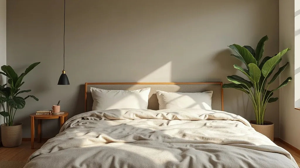
I once matched a lime-washed wall to a paint chip and painted a whole room from it. By ten in the morning the walls read grey and slightly sour, and nothing in the room agreed with them. The lesson stayed with me: the wabi sabi color palette is built from materials rather than paint chips. Lime plaster white, unbleached linen, raw clay, greige, taupe, pale wood, with quiet greens like sage or moss dust as accents. In practice it works on a rough 60/30/10 split: a soft neutral on the walls, two or three warm mid-tones in textiles and wood, and one darker earth tone for depth. What breaks it is not a colour but a finish. Anything glossy, optically brightened white, or perfectly uniform.
In short
- Wabi-sabi colours are pigments found in real materials: chalk, lime, clay, flax, ash, unfinished wood.
- Use roughly 60% soft neutral, 30% warm mid-tones, 10% deep earth accent, and let texture do the contrast.
- North light needs warmer greige and clay; south light can carry cooler lime white and grey-green.
- Pure brilliant white, high gloss, cool grey and plastic sheen are what actually break the palette.
What are wabi-sabi colors, exactly?
They are the colours of materials left close to their raw state. Wabi-sabi, in Japanese aesthetics, is an appreciation for the imperfect, the weathered and the incomplete. Applied to colour, it means you choose a tone because a material actually produces it, not because a fan deck named it.
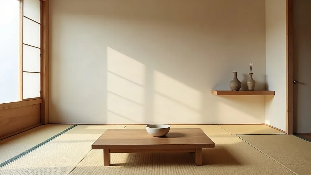
The material origin of wabi-sabi colors: clay, lime, flax, ash
When I plan a room, I start from a small pile of samples on the floor rather than from swatches. The palette that emerges is almost always the same family.
- Lime plaster white: a chalky, slightly cloudy white with visible trowel movement, never flat.
- Unbleached flax: the oat-to-grey of unbleached linen, warm in daylight, softer once washed.
- Raw clay: from pale bisque to terracotta shadow, depending on the iron in the earth.
- Wood ash and charcoal: cool-warm greys with a faint brown underneath, the tone of a fired kiln shelf.
- Pale wood: oak, ash and hinoki cypress, honey-blond to bone, always matte when left unvarnished.
- Greige and taupe: the transition tones that let all the others sit together.
Off-white vs pure white in a wabi-sabi palette
Brilliant white is the single most common mistake I correct in homes. Most brilliant whites are tuned with a trace of blue-violet pigment so they read cleaner under artificial light. Next to linen and clay, that blue turns the fabric yellow and the wood orange.
A useful marker here is LRV (light reflectance value), the percentage of light a colour bounces back, from 0 for black to 100 for a theoretical pure white. Brilliant whites sit around 85 and above. The off-whites that hold a wabi-sabi room sit roughly between 70 and 82: enough light for a small space, not enough glare to flatten texture. Choose one with a warm or greenish undertone rather than a blue one.
The quiet greens: sage, moss dust, olive shadow
Green enters this palette the way it enters a garden wall: dusty, greyed, low in saturation. Sage green, the grey-green of dried moss, and a deep olive shadow all work because they read as a neutral from across the room. Test this way: if a green still looks like a colour when you squint, it is too saturated. These greens belong in small quantities, on a cushion, a glazed bowl, or a single painted door.
How to build a wabi-sabi palette in three layers
Colour decisions go wrong when they are made in the wrong order. Walls first, then the fixed materials you cannot change, then textiles, then one dark note last. Working that way, you only ever choose against something that already exists in the room.
The 60/30/10 rule applied to wabi-sabi tones
Roughly 60% of visible surface goes to the anchor neutral: walls, ceiling, large curtains. Around 30% goes to warm mid-tones: wood, rattan, stone, upholstery, rugs. The last 10% is a single deep earth accent. Keep the three layers inside two or three steps of each other in depth and the room will feel continuous rather than assembled.
| Anchor (60%) | Mid-tones (30%) | Deep accent (10%) |
|---|---|---|
| Lime white, warm undertone | Pale oak, oat linen, travertine | Charcoal ash |
| Greige | Raw clay, rattan, undyed wool | Burnt terracotta |
| Warm off-white | Taupe, bleached ash wood, paper | Olive shadow |
Choosing the anchor neutral for walls
The anchor should be the palest tone in the room, but never the whitest possible. I test it against three things before committing: the floor, the largest piece of wood, and the daylight at its weakest hour. If the wall makes the floor look pink or the oak look orange, the undertone is wrong. A matte finish matters as much as the colour; a flat or ultra-matt wall holds shadow and lets the surface breathe.
One deep earth accent, and where to place it
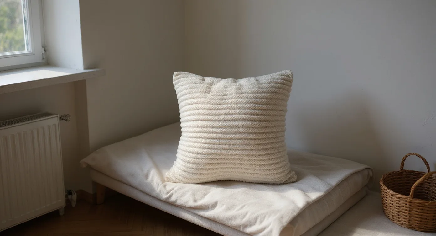
The textile layer is where the 30% actually lands, and it is the cheapest layer to correct. For an ecru or greige sofa corner, the piece I reach for most often is a chunky knitted pillow in an undyed tone, because the stitch grain reads as texture from a distance and never fights the wall colour. Then place the dark accent low and once or twice only: a charcoal ceramic on a low shelf, a dark stool, the shadow line of an open doorway. Placed high, a dark note pulls the eye up and the room loses its calm.
Wabi-sabi colors in north light vs south light
Orientation changes a neutral more than any other factor. North light is steady, cool and blue-leaning throughout the day. South light is warmer, brighter and shifts considerably between morning and late afternoon. The same greige can read as mushroom in one room and as cold cement in the other.

| Light | Works well | Avoid | Materials to add |
|---|---|---|---|
| North / east | Warm greige, clay bisque, oat, sand | Cool grey, blue-white, pure white | Rattan, oak, wool, terracotta |
| South / west | Lime white, chalk, grey-green, pale stone | Yellow-based cream, peach beige | Travertine, linen, ash wood, paper |
Warming a north-facing room with clay and greige
In a north room, add warmth in the pigment and not in the lighting alone. A greige with a red or yellow trace under it, clay-toned pottery, and one rug in undyed wool will do more than three extra lamps. Keep the sheen very low, since cool light already flattens colour.
Keeping south light calm with lime white and grey-green
South rooms can take a cooler, chalkier white without going clinical. Grey-green reads beautifully here in the afternoon, when the light turns golden and neutralises it. Linen curtains, unlined, soften direct sun without dimming the room.
Testing tones at three times of day
Look at your sample three times: morning, midday, and in the evening under your own warm bulbs. Most palettes fail at the third check, because a colour chosen at noon can turn muddy under a 2700K lamp. If a tone holds across all three, it will hold all year.
Texture over contrast: why a wabi-sabi palette needs matte
In a room where every tone is within a few steps of the others, contrast has to come from somewhere else. It comes from grain, weave and finish. A rough plaster wall next to smooth stone next to open-weave linen creates more visual interest than any bold accent colour, and it does it without raising the volume of the room.
Matte, chalky and raw finishes that hold the palette
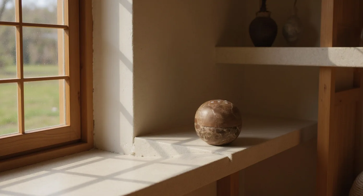
Gloss reflects the light source, which means it shows you the lamp instead of the material. Matte surfaces scatter light and reveal the object's own relief: the pores of travertine, the knots in pale wood, the lip of a hand-thrown glaze. On the low table in my own living room, I keep a carved stone incense burner for exactly this reason, since its cut face and rough sides show two different greys under one light while staying a single colour.

Layering three textures inside one tone family
Pick a tone family, then find three grains inside it. Oat linen, undyed wool, and washi paper are all off-white, but they behave differently: linen falls, wool absorbs, paper glows. Three textures in one colour will always read calmer than three colours in one texture.
What breaks a wabi-sabi color palette (and the fix)
Most rooms that miss the mark have the right colours and the wrong finishes. The corrections below are small, and none of them require repainting everything.
Cool grey, brilliant white and gloss: the three usual culprits
Cool grey sits on top of earth tones instead of beside them, and the room turns cold. Brilliant white flattens plaster and makes linen look dirty. Satin and semi-gloss paint bounce hard highlights across the wall. The fix is usually a finish change rather than a colour change: repaint the same value in flat matt, swap glossy ceramics for unglazed or ash-glazed pieces, and replace any bright-white lampshade with paper or linen.
Too many accent colors, not enough repetition
Four accents used once each will always feel busier than one accent used three times. Choose your deep earth tone, then repeat it at three points spread across the room, ideally at different heights. Everything else returns to the neutral family.
Mixed wood tones and how to reconcile them
You rarely get to match wood exactly, and matching is not the goal. Aim for a shared undertone instead: keep everything on the warm side or everything on the ashy side, and let the depths differ. If two woods still argue, run a linen or wool textile between them, in a tone that sits halfway. The eye reads the bridge and stops noticing the gap.
Wabi-sabi color palette: your questions answered
What are wabi-sabi colors?
They are material-derived neutrals: lime plaster white, unbleached linen, raw clay and terracotta, greige, taupe, ash grey, pale unvarnished wood, and low-saturation greens such as sage or dried moss. All of them are muted, warm-leaning and matte. If a colour looks like something you could dig, weave or fire, it belongs.
What does wabi-sabi literally mean?
The two words come from separate roots in Japanese. Wabi originally suggested the austerity and quiet of a simple, solitary life, while sabi points to the beauty that age and wear bring to a thing. Together they describe an appreciation of the imperfect, the modest and the impermanent.
What are some Japanese-inspired colors for a home?
Indigo, in its faded and mid-blue ranges, comes from natural fermentation dyeing and sits well with off-white. Sumi ink black, ash-glaze grey, hinoki-blond wood, and the warm cream of washi paper are all drawn directly from traditional crafts. Used sparingly against neutrals, they read as depth rather than as colour.
What is the difference between japandi and wabi-sabi colors?
Japandi is the meeting of Scandinavian and Japanese design, so its palette runs slightly lighter, cooler and more graphic. A wabi-sabi palette stays warmer, earthier and more irregular. In practice the two overlap by more than half, and many rooms sit comfortably between them.
Can you use black in a wabi-sabi palette?
Yes, as long as it is a soft, matte black with brown or blue depth in it rather than a flat jet black. Keep it to a small share of the room, roughly the 10% accent, and repeat it two or three times so it feels intentional. Charcoal, sumi ink and burnt wood tones all do this job well.
If you want to see these tones together in real objects before committing to a wall colour, our collection of calm, handmade pieces is a good place to start. Bring one home, live with it in your own light, and let the room tell you what it needs next.
Explore the Wabi Sabi Home Decor collection
Browse pieces in clay, stone, linen and pale wood, the tones this palette is actually made of.
Browse the collection →